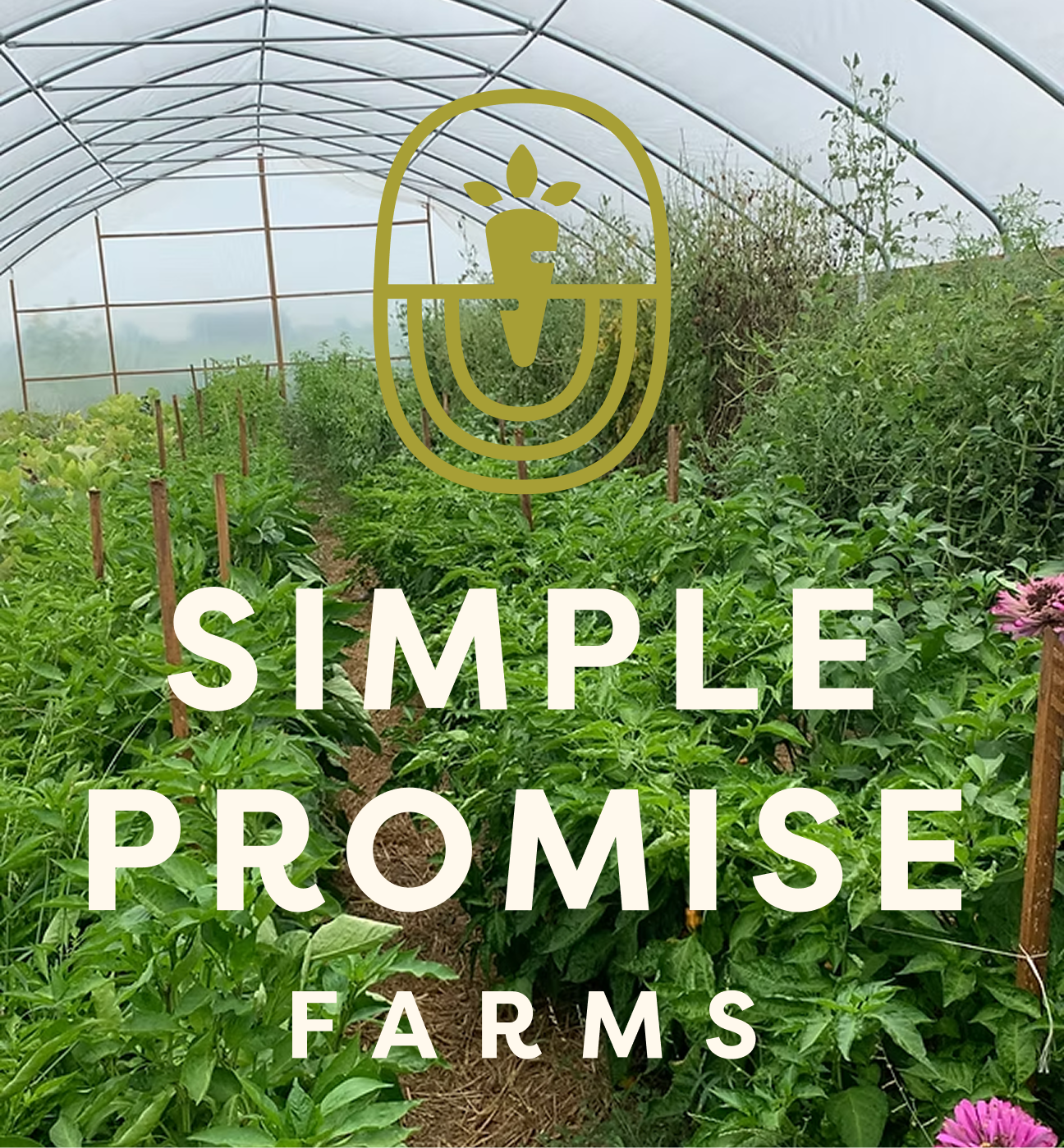
Simple Promise Farms
Brand Guide
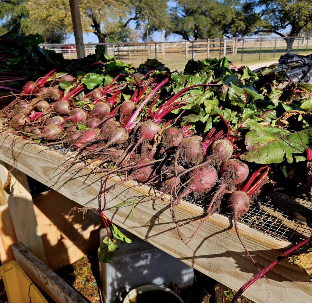
Cultivating Hope for Long-Term Recovery
Simple Promise Farms, situated in Elgin, TX, is more than just a working farm; it's a beacon of hope for individuals recovering from drug and alcohol addiction. Our philosophy revolves around creating an active, community-driven environment that instills a sense of responsibility and aids in recovery.
The core of our brand
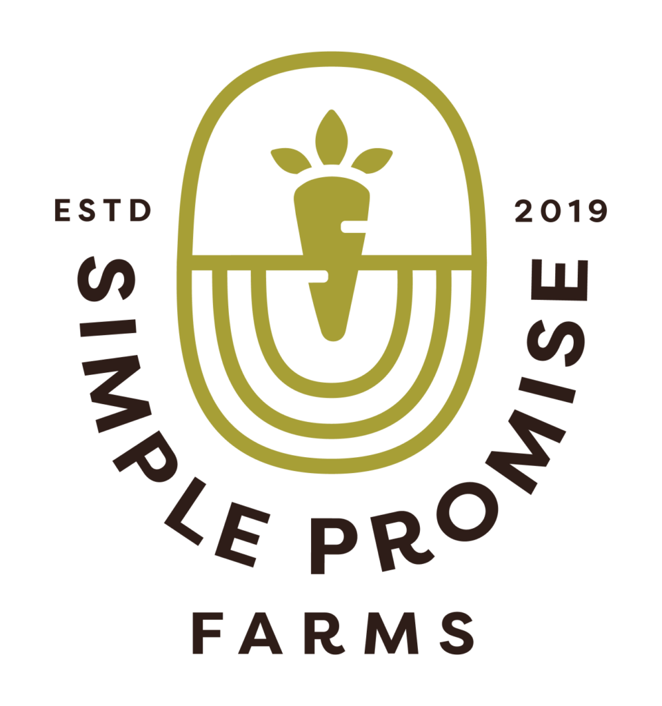
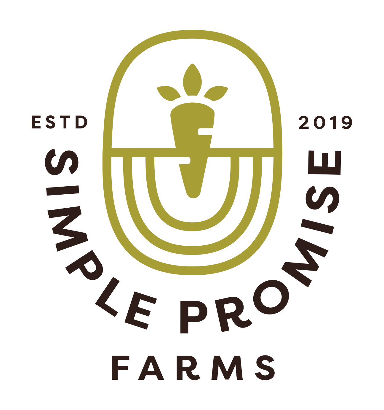
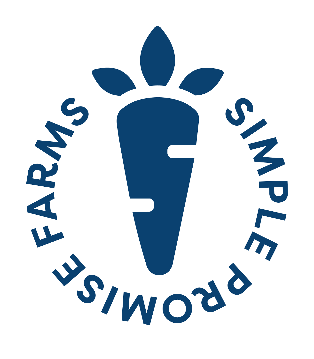
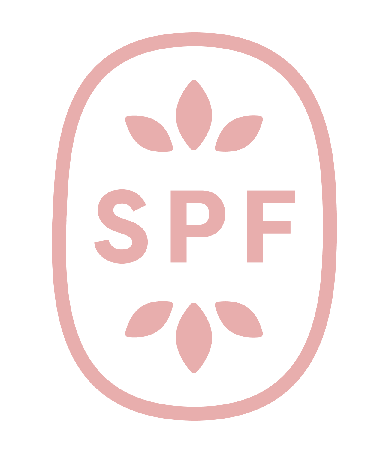
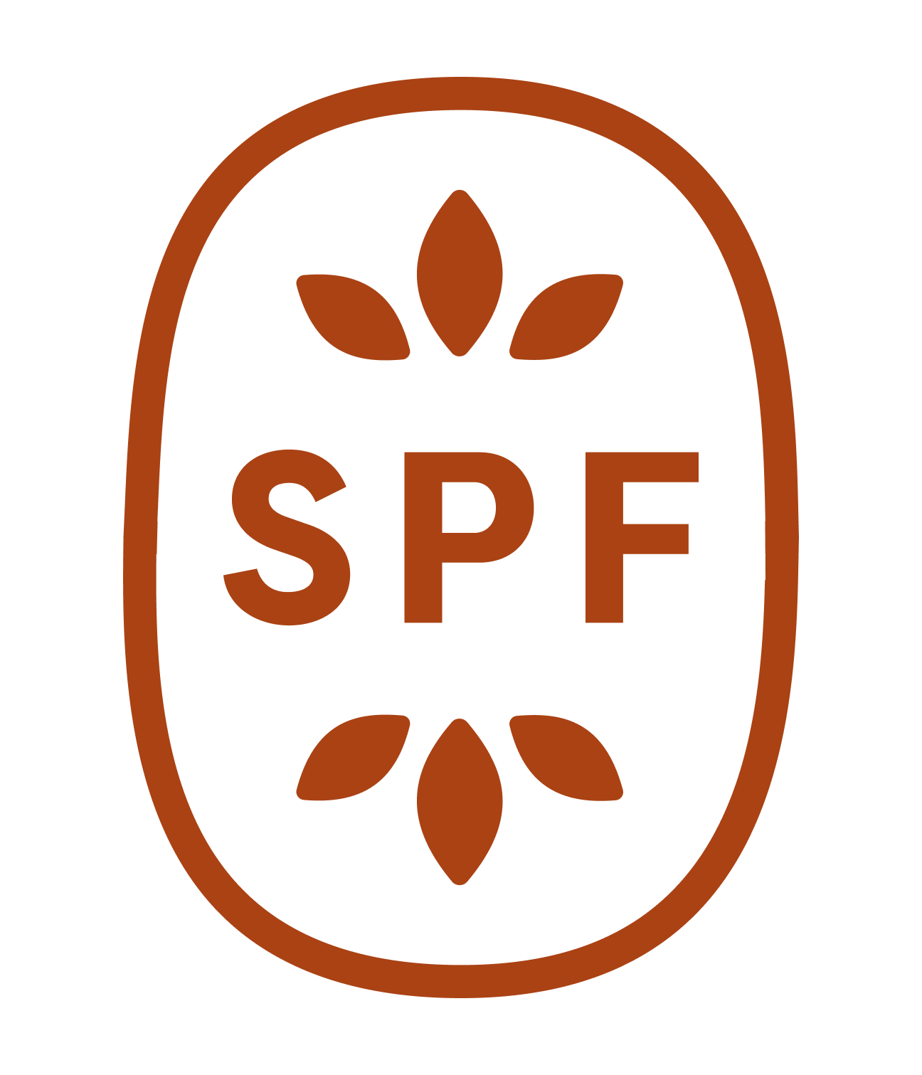
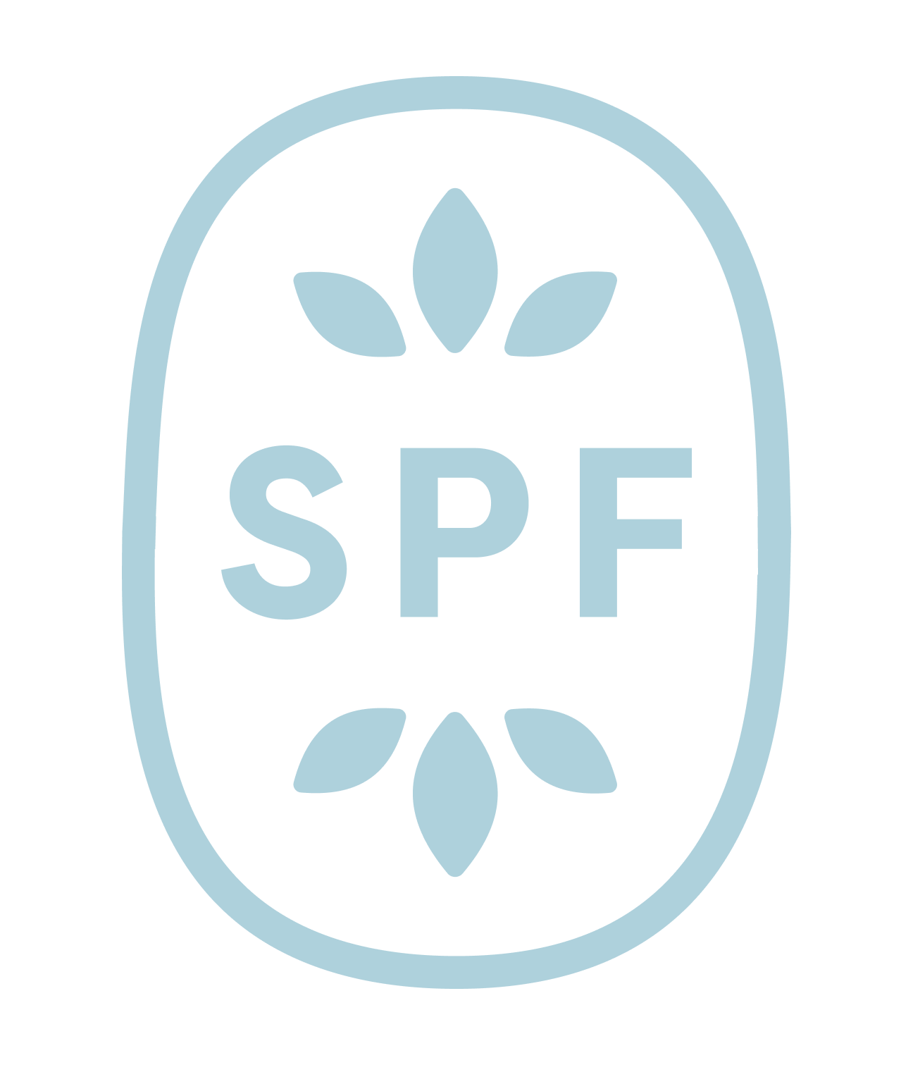
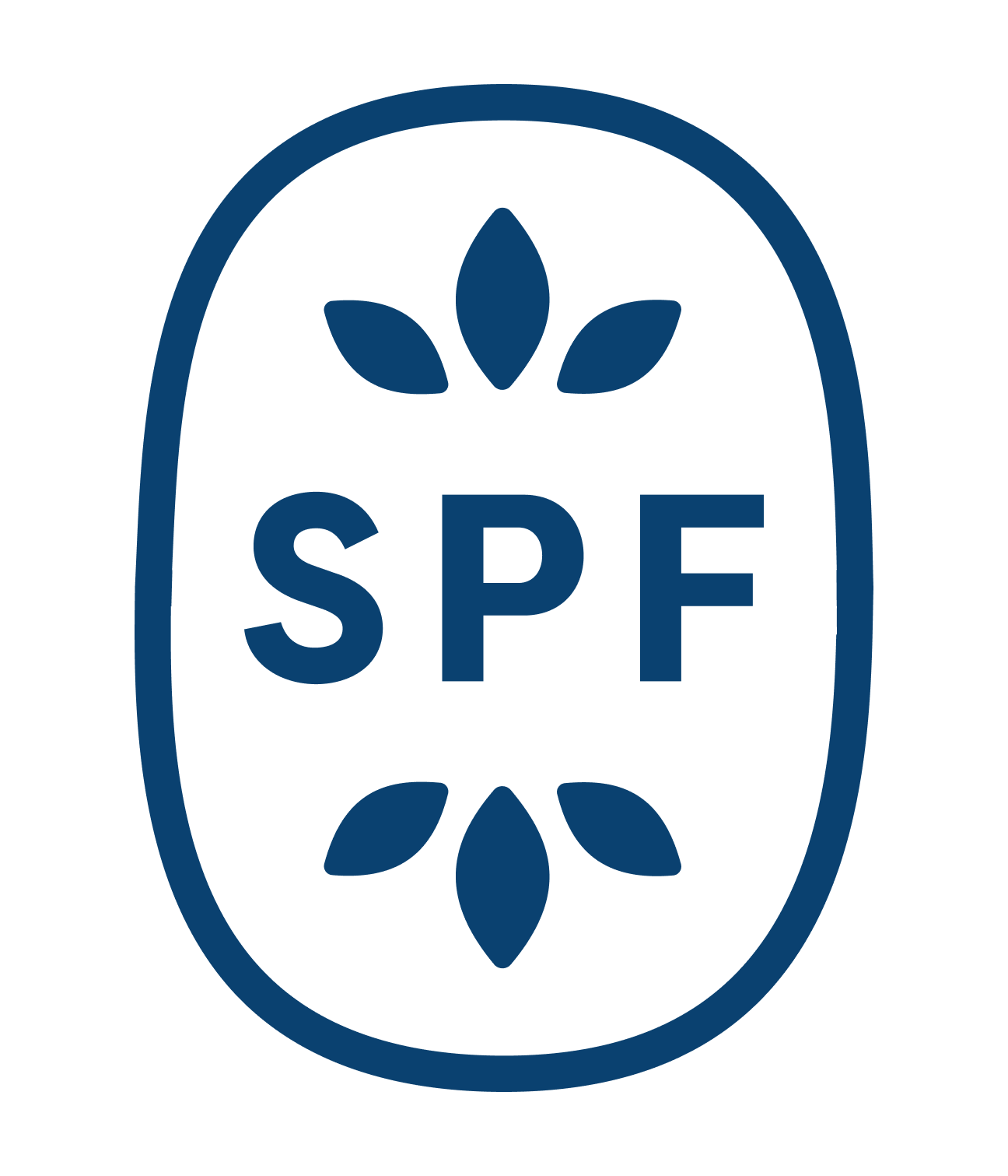
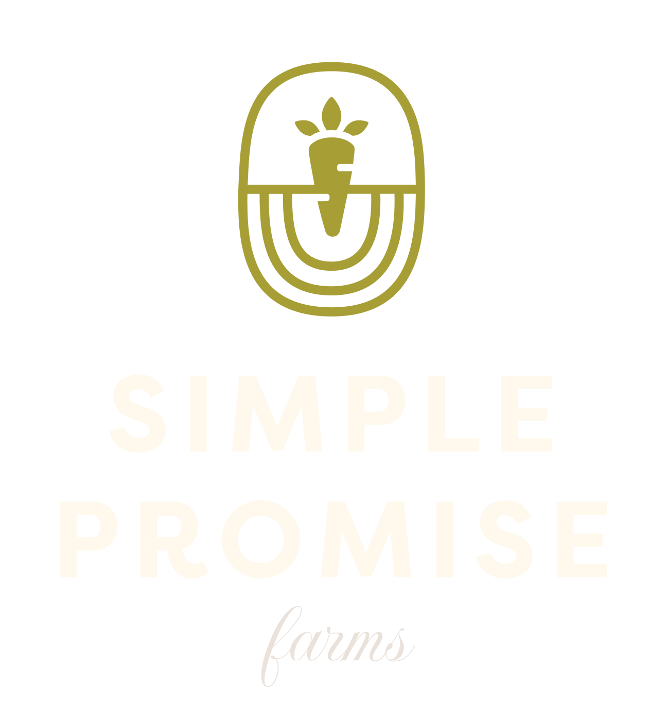
Our Logo Suite
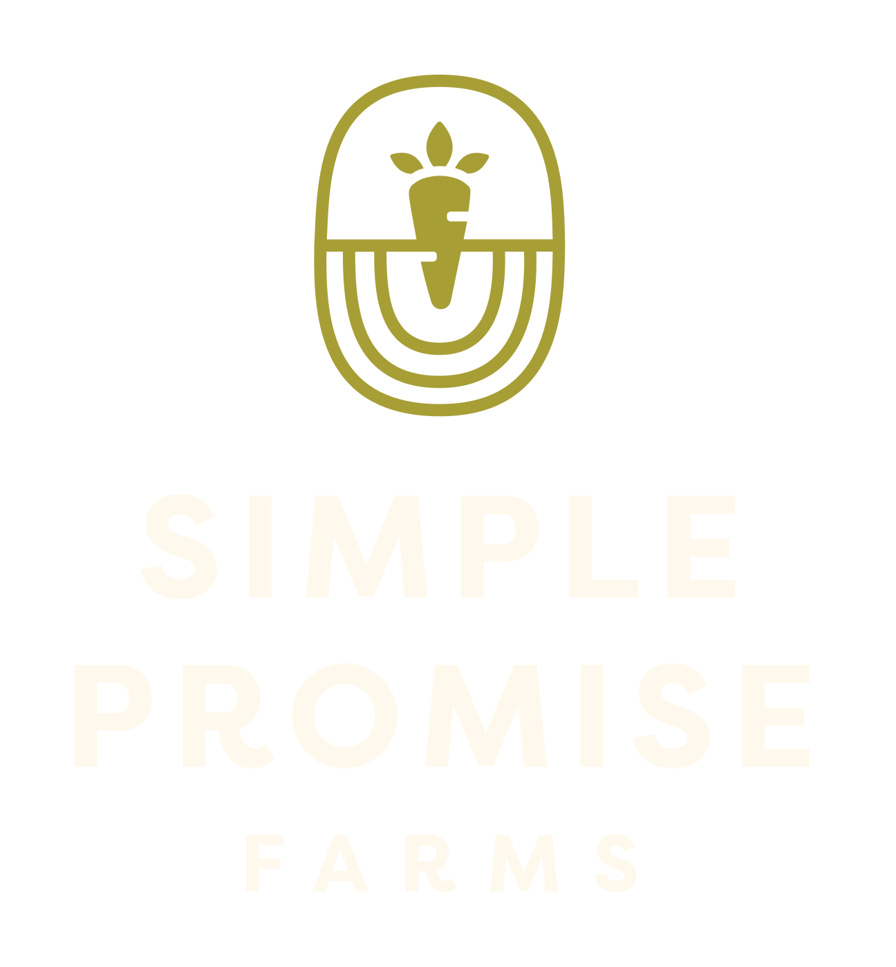
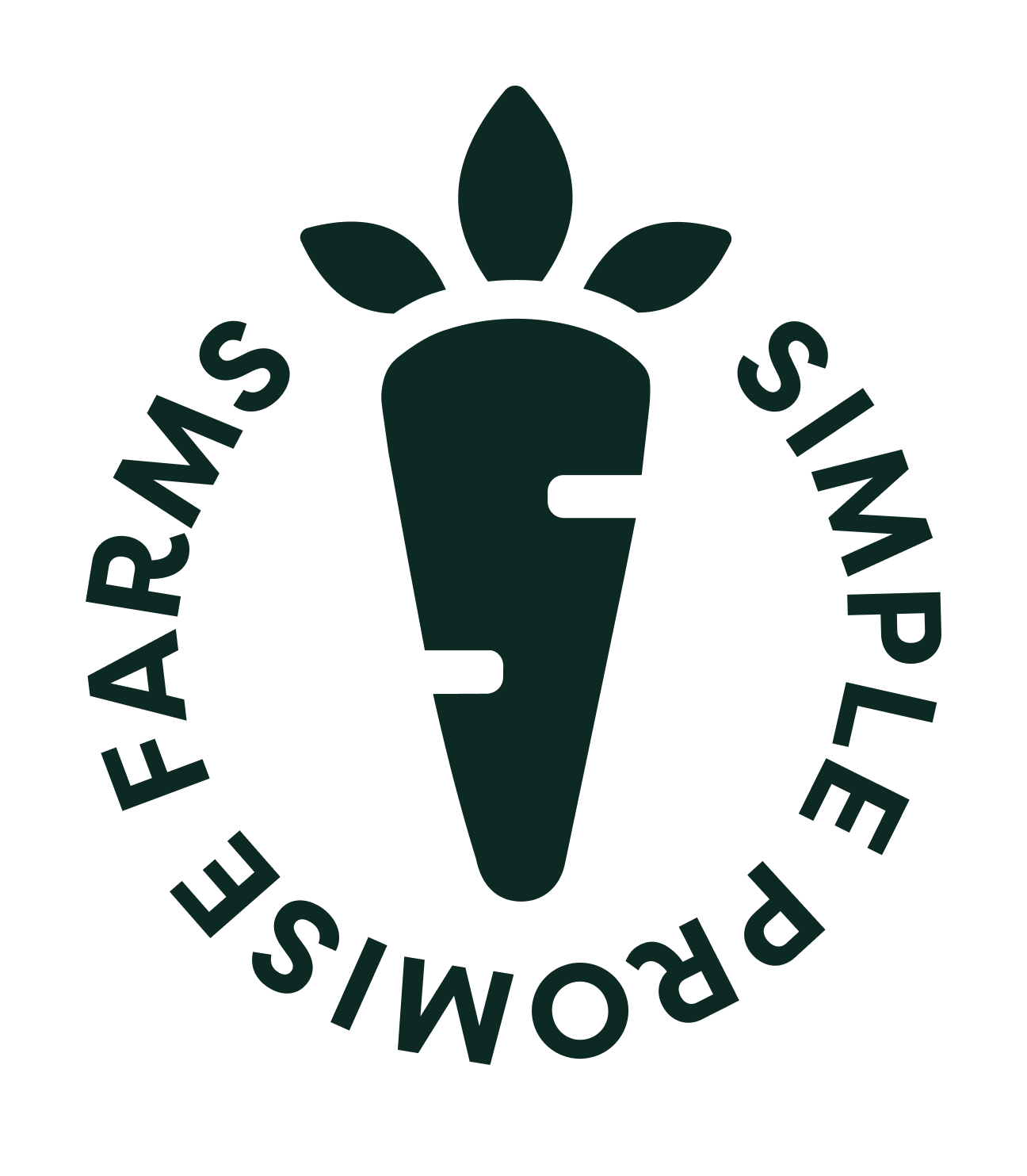
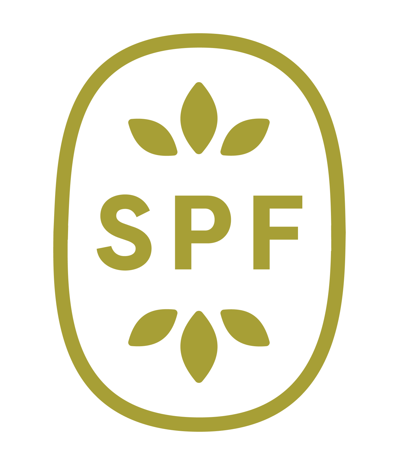
Primary Vertical Light BG
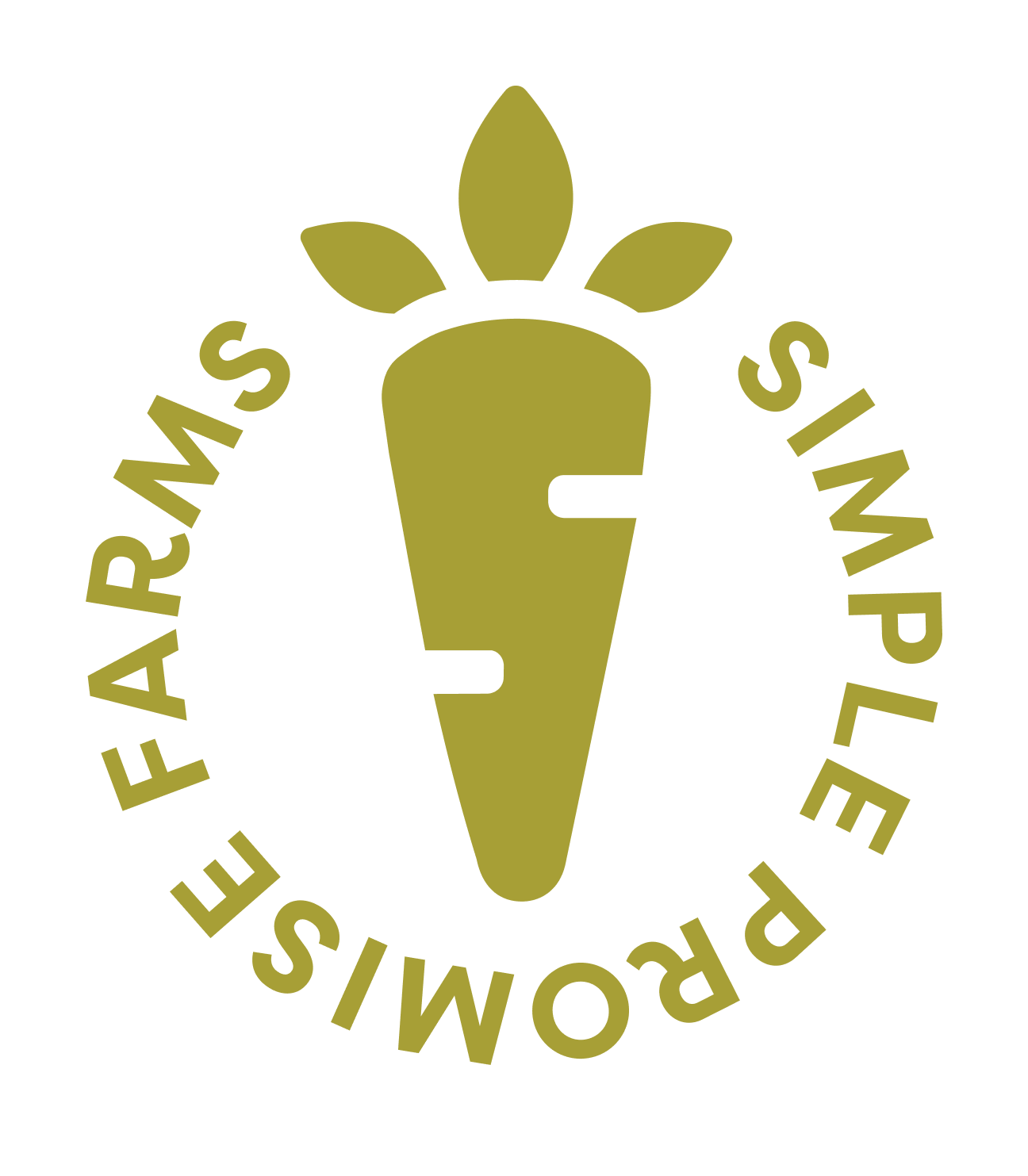
Primary Vertical Dark BG

Primary Vertical Black
Primary Vertical White
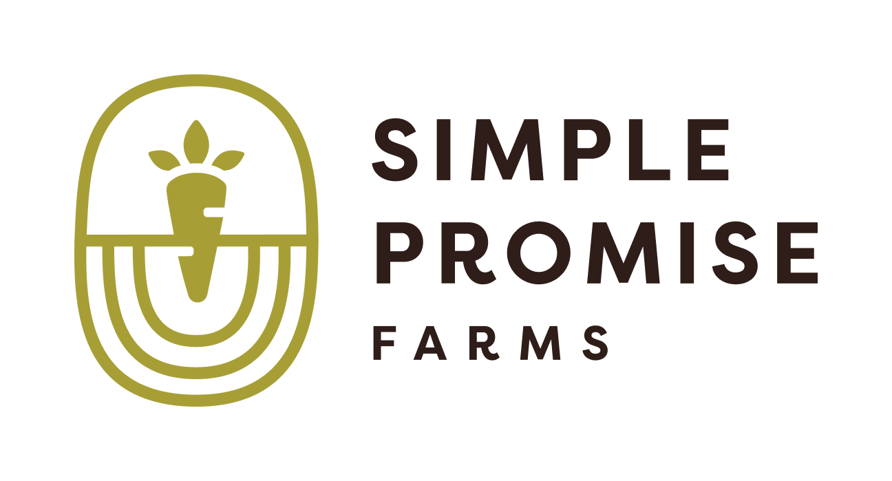
Primary Horizontal Light BG
Primary Horizontal Dark BG

Primary Horiztonal Black
Primary Horizontal White
ESTD Logo Light BG
ESTD Logo Dark BG

ESTD Logo Black
ESTD Logo White
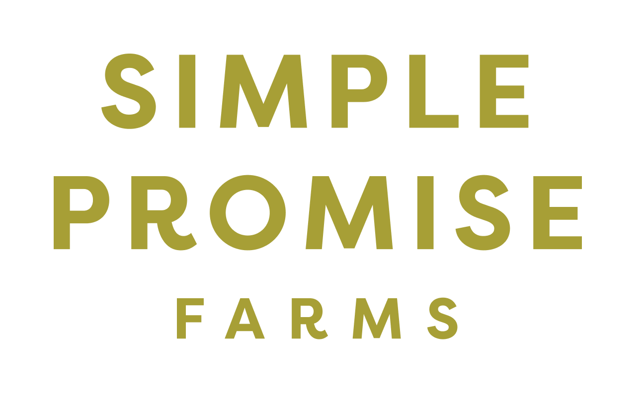
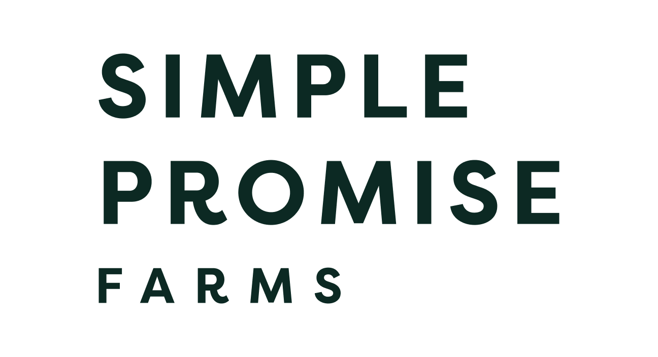
Word Mark
Our Word Mark is the same as the Primary Logo without the icon. It is to be used on all official collateral when the space does not allow for the full Primary Logo lock-up. Use vertical and horizontal variations used as needed.
Only set it in the following approved colorways. The Black and White colorways are only to be used on brand partnership collateral when required by brand partners.
Word Mark Vertical Barnwood Brown
Word Mark Vertical Good Work Green
Word Mark Vertical Lemon Lime
Word Mark Vertical Compassion Cream

Word Mark Vertical Black
Word Mark Vertical White

Word Mark Horizontal Barnwood Brown
Word Mark Horizontal Good Work Green
Word Mark Horizontal Lemon Lime

Word Mark Horizontal Compassion Cream

Word Mark Horizontal Black
Word Mark Horizontal White
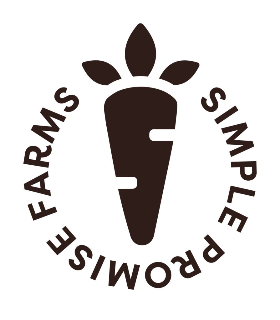
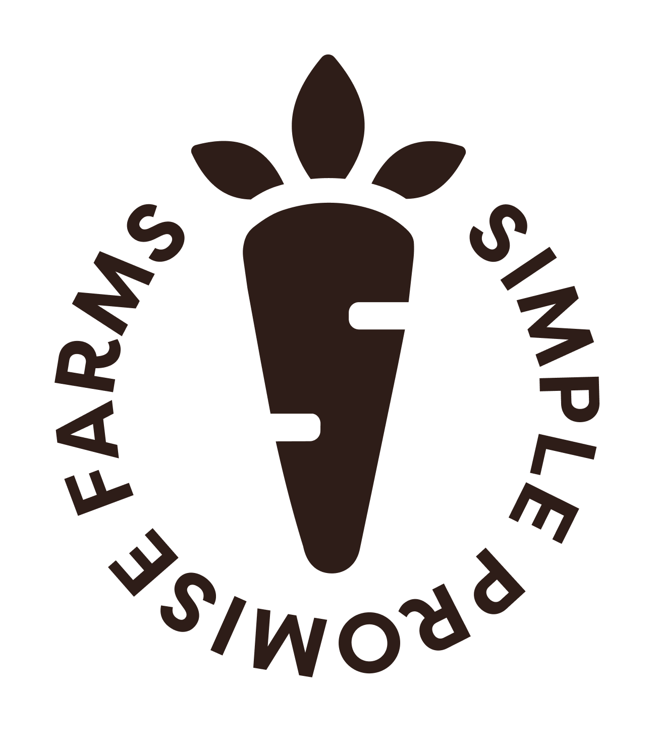
Badge Mark
Our Badge Mark is an alternative logo design that may be used in place of the Primary Mark on select key graphics and merchandise. Only set it in the following approved colorways. As this mark lives between a logo and a design element, it can be set in a low contrast color and background combo if it lends to the design.
Badge Mark Barnwood Brown
Badge Mark Good Work Green
Badge Mark Lemon Lime
Badge Mark Caring Cream
Badge Golden Grain
Badge Pickled Patch
Badge Petal Pink
Badge Reddish Radish
Badge Simple Sky Blue
Badge Breezy Blue
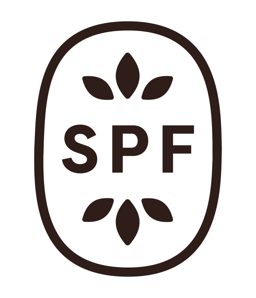
Monogram
The SPF monogram is a simplified expression of the primary mark. The letters are anchored by leaves at the top and bottom, referencing growth, healing, and the ongoing process of recovery.
Utilize this mark when space doesn't allow for either the Primary Logo or the Word Mark. It may be used on applications such as social media posts and merchandise. Set it in the following approved colorways.As this mark lives between a logo and a design element, it can be set in a low contrast color and background combo if it lends to the design.
Monogram Barnwood Brown
Monogram Good Work Green
Monogram Lemon Lime
Monogram Caring Cream
Monogram Golden Grain
Monogram Pickled Patch
Monogram Petal Pink
Monogram Reddish Radish
Monogram Simple Sky Blue
Monogram Breezy Blue
Primary Icon
The Primary Icon is broken down from the primary logo, and it may be used on applications such as social media posts and merchandise. Set it the following approved colorways. As this mark lives between a logo and a design element, it can be set in a low contrast color and background combo if it lends to the design.
Primary Icon Barnwood Brown
Primary Icon Good Work Green
Primary Icon Lemon Lime
Primary Icon Caring Cream
Primary Icon Golden Grain
Primary Icon Pickled Patch
Primary Icon Petal Pink
Primary Icon Reddish Radish
Primary Icon Simple Sky Blue
Primary Icon Breezy Blue
Secondary Icon
The Secondary Icon is broken down even more from the primary logo, and it may be used on applications such as social media posts and merchandise. Set it the following approved colorways. As this mark lives between a logo and a design element, it can be set in a low contrast color and background combo if it lends to the design.
Secondary Icon Barnwood Brown
Secondary Icon Good Work Green
Secondary Icon Lemon Lime
Secondary Icon Caring Cream
Secondary Icon Golden Grain
Secondary Icon Pickled Patch
Secondary Icon Petal Pink
Secondary Icon Reddish Radish
Secondary Icon Simple Sky Blue
Secondary Icon Breezy Blue
Our Logo
Usage
Safe Space
When displaying any of the logo variations, maintain ample space around it to avoid crowding or interference from other elements. To achieve this, don’t place anything within the “safe space” equivalent to 10% the width of the logo.
*Of course, there are exceptions: subtle patterns or textures overlapping at 20% opacity or less are acceptable.
Please Don't
Use unapproved color combinations or colors
Distort the logo and elements
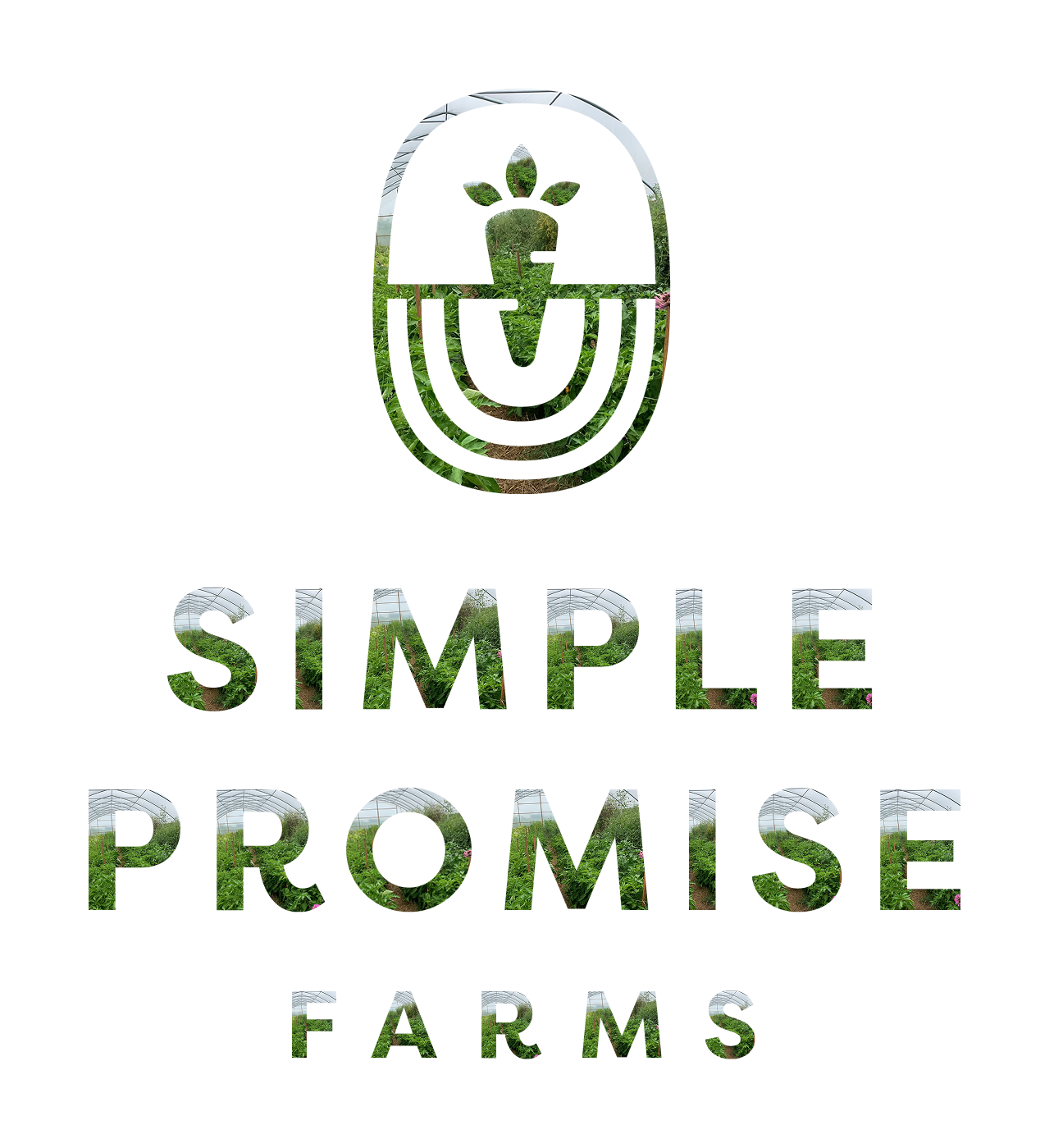
Mask images into the logo
Place logo on backgrounds that make elements hard to read
Use alt fonts
Typography
Our Font Families
Subheadings & Buttons - Filson Pro Bold, +15% Tracking, All Caps
ABCDEFGHIJKLMNOPQRSTUVWXYZ1234567890!@#$%^&
Headings - Albiona Medium
Aa Bb Cc Dd Ee Ff Gg Hh Ii Jj Kk Ll Mm Nn Oo Pp Qq Rr Ss Tt Uu Vv Ww Xx Yy Zz
1234567890!@#$%^&
Body - Filson Pro Book
Aa Bb Cc Dd Ee Ff Gg Hh Ii Jj Kk Ll Mm Nn Oo Pp
Qq Rr Ss Tt Uu Vv Ww Xx Yy Zz 1234567890!@#$%^&
depth through
Design Elements
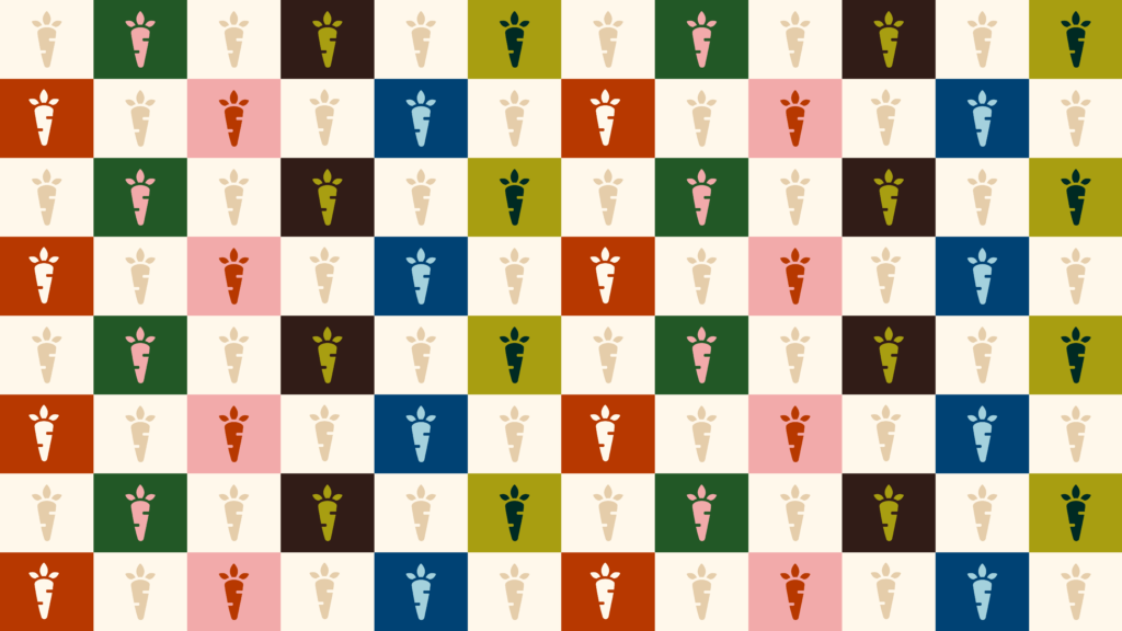
Pattern
Our brand pattern reimagines a classic farmstead gingham through the repetition of our carrot icon, creating a rhythm that feels distinctly our own. Mix and pair colors from the palette as needed to create the pattern, ensuring each combination includes a lighter color to maintain the classic gingham structure and contrast.

Background Texture
Our Background Texture adds that extra depth to key graphics when needed. Overlay on a low level of opacity with the multiply setting when things are looking a little flat.
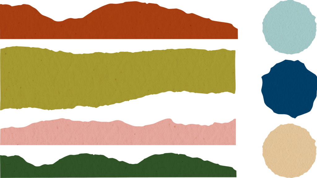
Soil Layer Textures
Our Soil Layers are a key asset that tells the story of Simple Promise Farms, illustrating the deeper process of recovery and growth beneath what is immediately visible. Each layer should remain visually distinct, with enough contrast in tone, texture, or edge treatment. Use layers to add texture to key graphics and select merchandise, and as holding shapes to frame photos. Typically 2–4 layers is enough to communicate depth without overwhelming the composition.
Brand in action